Recognition
2018 AIGA Medal
Born
1936, A Coruña, Spain
By Norman Hathaway
September 17, 2018
Recognized for originating an enduring graphic style instrumental in defining both underground comix and the psychedelic rock posters of the ’60s, and for their indelible impact on American culture.
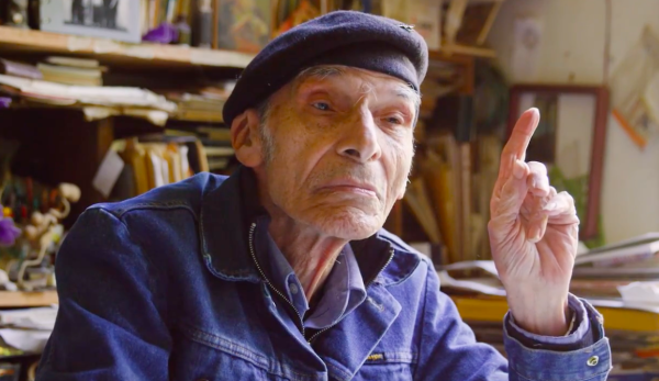
Victor Moscoso shot to white-hot fame during the ’60s, defining the decade with his vibrant colors, liquid letterforms, and one-of-a-kind drawing style. His posters and underground comics seem to defy the 2-D pages they inhabit, thoroughly exploring staging, space, movement, and time in ways that paved the way for a new visual era.
Moscoso’s path as a designer began in Brooklyn, to where his family immigrated when he was 3 years old. There, he experienced such a profound moment while watching his first animated film that he immediately decided to become an animator. He attended the School of Industrial Art, then moved on to Cooper Union in 1954. While studying under Franz Kline and Herbert Matter, Moscoso showed a precocious aptitude for lettering, and even won the princely sum of $100 in a school competition. The success emboldened him to continue his education at Yale, where he studied under Josef Albers. Later, Moscoso would call upon his love of movement, lettering expertise, and Albers’ groundbreaking color theory to create drawings that seemed to move and vibrate.
In 1959, Moscoso heard the siren call of the Beat poets and left New York for California, settling in Berkeley. He taught stone lithography at the San Francisco Art Institute, where he became immersed in the nascent Bay Area music scene. In 1964, Moscoso noticed an early fly-poster for a Paul Butterfield Blues Band concert, created by Wes Wilson. He was intrigued by how it opposed advertising’s design orthodoxy of clarity and immediacy—emphasizing the overall lettering mass more than the letterforms themselves.
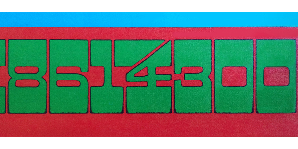
The Blushing Peony (detail), 1967, offset lithography © Victor Moscoso.
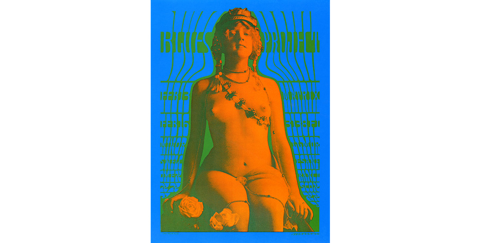
Chambers Bros, 1967, offset lithography, © Victor Moscoso.
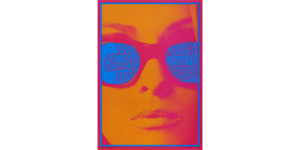
Chambers Bros, 1967, offset lithography, © Victor Moscoso.
Feeling he was well trained to create designs in this vein, Moscoso set to work. The result, his 1966 poster A Stone Facade, which featured more polished lettering, was a bit of a misfire. Nevertheless, he continued to woodshed—shifting the focus to the interior spaces of his letterforms, based on designs by early twentieth-century Viennese Secession designer Alfred Roller. This unorthodox approach helped Moscoso realize that he could save time by drawing only the space between the letters, plotting the in-between spaces in pencil, then inking the negative space with his Rapidograph in a single stroke.
Moscoso was also struck by Alton Kelly’s use of appropriated historical images and began incorporating photographs and collages into his own compositions. He took black-and-white portraits of Native Americans and French postcard nudes and revitalized them for a new era by reprinting them in blaring colors, ditching blacks altogether. This color strategy caused an intentional visual havoc, blurring the line between foreground and background.
One of his most successful uses of this approach was his 1967 poster for the Blues Project. He took a nude from an antique French postcard and enlarged it to fill the height of the poster. Then he flowed the wording around the nude form as though it were a curtain wrapping around the silhouette. It was his first full-blown attempt at treating a complete text as one single mass. His unusual color choices—a green of equal value to the blue background—served to emphasize the letterform’s negative spaces. The green is so bright it melds into the lettering itself, rendering Moscoso’s decision to forgo the outline for the type an expansion of this illusion. The bright orange of the figure gives the impression that it’s floating a few inches in front of the poster.
With each new poster, Moscoso took traditional design tenets and turned them on their heads. A mantra of “make lettering as easy as possible to read” became “make lettering nearly impossible to read”; “ensure colors are harmonious” became “ensure colors invoke epileptic seizures.” Beyond entering the visual zeitgeist, these designs landed him in the pages of Life magazine and his reputation quickly skyrocketed.
In the late 1960s, he developed pen-and-ink rendering techniques (stippling, halftone dots hand-drawn one-by-one, or crosshatching), sometimes combining several within a single drawing. His drawings could utilize solid black or white, with very little shading or transitional tones. He developed his own language of reflective black surfaces. In the tour de force poster for Neiman Marcus, Moscoso displayed this elegant and delicate ink-work by painstakingly drawing tiny letters that resembled stamens and a stipple shade that colored both petals and letters. Flower shapes convert into letterforms, completely dissolving the barriers between drawing and lettering for a single, serene floral entity.
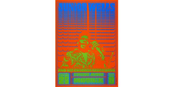
Junior Wells and His Chicago Blues Band, 1966, offset lithography, © Victor Moscoso.
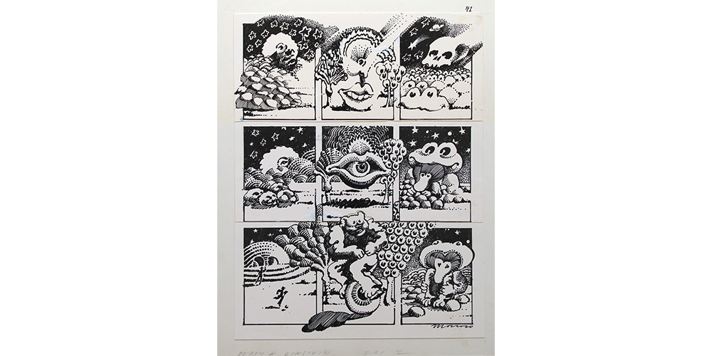
“Death & Einstein” (Zap no. 2), 1968, ink on paper, © Victor Moscoso.
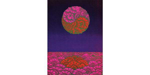
Neiman Marcus Poster Show, 1967, offset lithography, © Victor Moscoso.
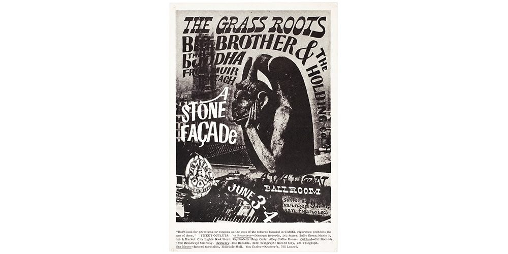
A Stone Façade, 1966, offset lithography, © Victor Moscoso.
Moscoso’s work in comics, like his posters, was rooted in the act of drawing. When he began a new creative alliance with Rick Griffin, the cartoonist and poster artist, the duo intentionally devised an unorthodox process to create a modern interpretation of the traditional comic book. Instead of simply executing a preconceived idea, he and Griffin took turns improvising a single row of panels. Later, they assembled the completed rows into single pages.
His earnest, meditative approach would sometimes lead Moscoso to create more than 100 detailed preparatory drawings in pursuit of the ultimate resolution. Working on top of an old door that he fashioned into a light table, he endlessly explored alternative positions of figures, limbs, or stars, pausing to critique the options, then refining the new drawing on separate sheets of paper until all possibilities had been fully explored.
In 1968, he and Griffin had just completed a few pages of their collaboration comic when Robert Crumb invited them both to partner with him for the second issue of Zap, one of the earliest and most historically important underground comics. Moscoso was enticed by Zap’s use of the black-and-white comic book format as well as the idea of self-publishing, so he and Griffin unscrambled their collaborative piece into single-author pages and gave them to Crumb for inclusion.
Eventually Moscoso created a solo seminal story for Zap, “Luna Toon,” featuring archetypal representations of the early Mickey Mouse. Mickey’s head floats through a pyramid-strewn landscape while morphing into abstract shapes, as the sky dreamily changes from dusk to dawn. This languid, no-dialogue approach was a unique retooling of conventional comic book storytelling. Moscoso’s comic work avoided all the familiar traditions of cartoon narrative: no vaudeville-based gag entertainment or punch lines. Instead, he provided a leisurely, agenda-less exploration of his own visual obsessions. His individual panels from these early pages are so strong they could easily have been repurposed as posters, and yet they still manage to flow together harmoniously on the page.
Zap became a sensation, serving as an inspiration to other designers and illustrators. Here was another path for those who had no desire to work for traditional publishers or galleries. They could instead become independent graphic artists and publishers and break free of traditional modernist ideas.
Moscoso cleared paths and perceptions; he is an inimitable master of drawing and poster design. We can trace his roots, but the full flowering of his talent seems like a magic act that defies explication or replication.